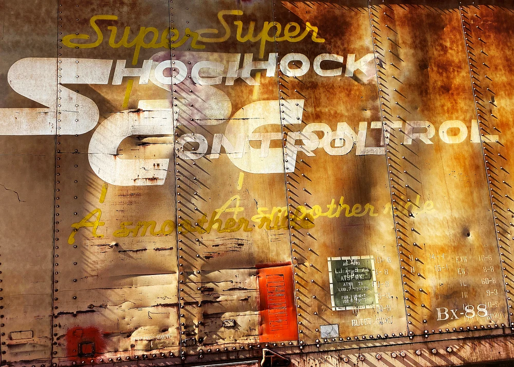
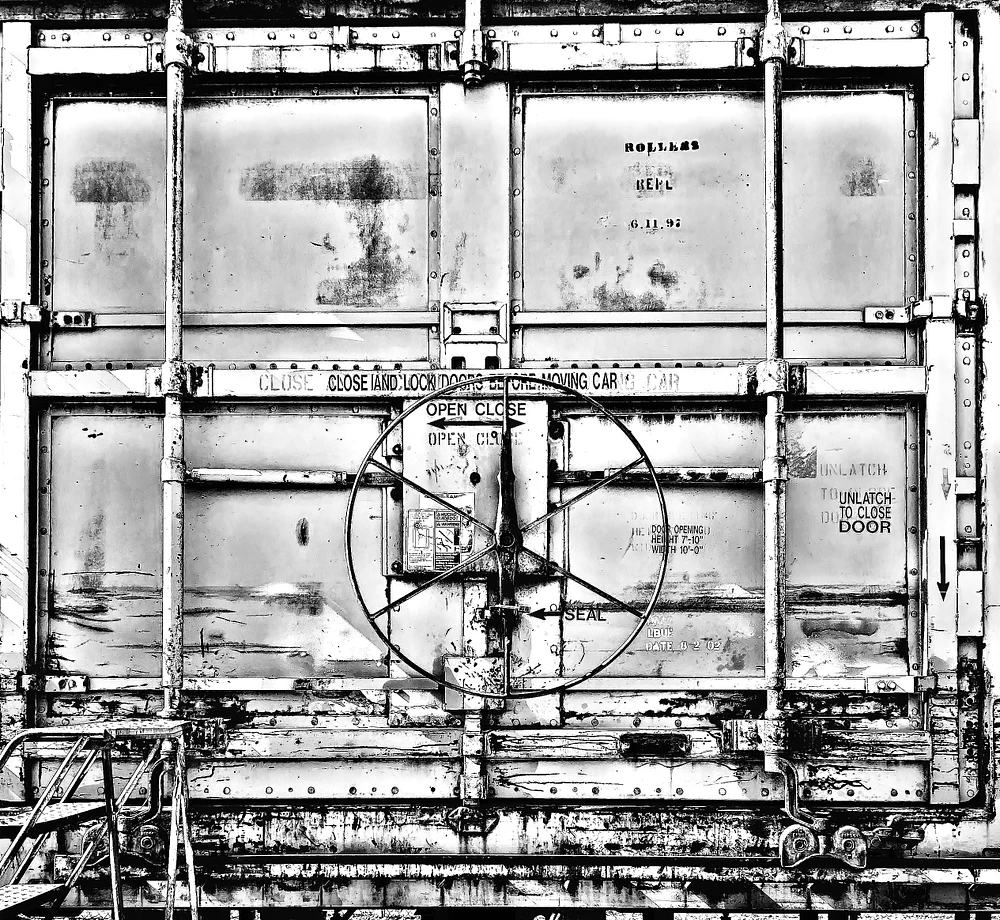
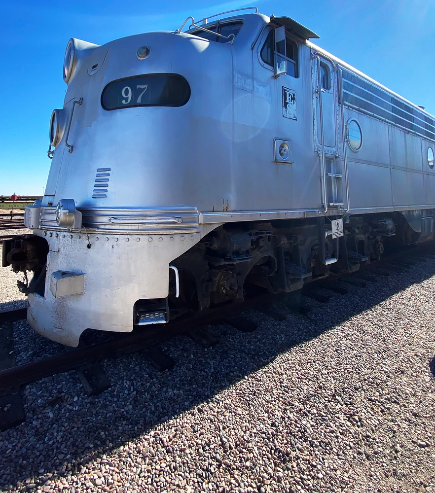
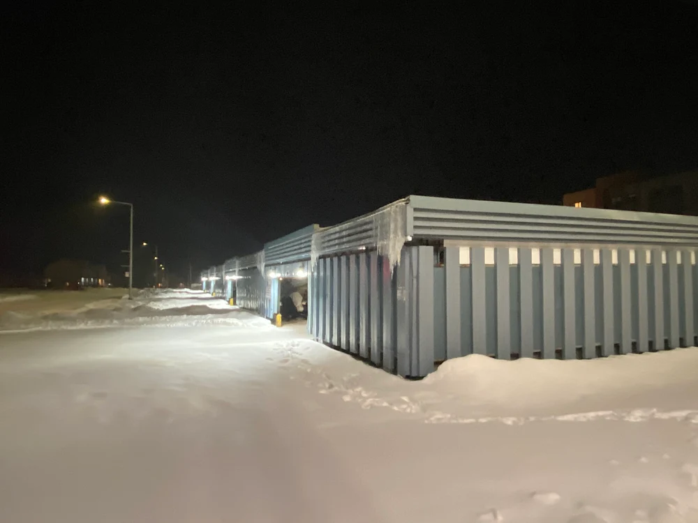
“SHOCK” dominates a weathered industrial sign, its pale block letters crossing a rust-streaked metal surface. “Super-Super” appears in yellow script near the top of the panel. The layered lettering gives the scene a playful, almost unruly energy, as if several graphic voices are competing for your attention. You can enjoy tracing the contrast between the bold white forms and the warmer handwritten strokes, then notice how the rust and seams make the surface feel timeworn and tactile. A small dark label and red rectangular patches punctuate the lower portion, while the repeated vertical ridges carry the eye across the design. Its mix of oversized type, fragments, and worn color rewards a slower look; each pass brings another shape or phrase forward. The result feels less like a polished advertisement than a vivid meeting of typography and age. All this on the side of a railway car!
“SHOCK” dominates a weathered industrial sign, its pale block letters crossing a rust-streaked metal surface. “Super-Super” appears in yellow script near the top of the panel. The layered lettering gives the scene a playful, almost unruly energy, as if several graphic voices are competing for your attention. You can enjoy tracing the contrast between the bold white forms and the warmer handwritten strokes, then notice how the rust and seams make the surface feel timeworn and tactile. A small dark label and red rectangular patches punctuate the lower portion, while the repeated vertical ridges carry the eye across the design. Its mix of oversized type, fragments, and worn color rewards a slower look; each pass brings another shape or phrase forward. The result feels less like a polished advertisement than a vivid meeting of typography and age. All this on the side of a railway car!
Privacy and cookie policy
This site uses cookies to enhance your browsing experience, serve personalized content, and analyze traffic. By continuing to use this site you agree touse of cookies and stewardship of your data.
 Daniel Royer Photography
View More Photos
Skip to Main Content